
We already study and customize the Blogger Header and body section. It’s time to study further about the Blogger layout. If you wish to customize the Blogger Minima template extensively, this is better to know more about the overall template layout.
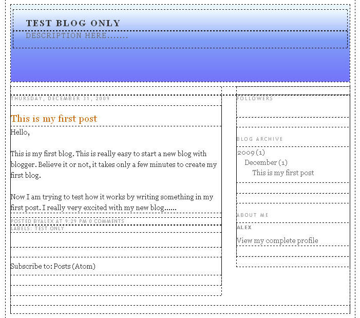
Let’s take a look at the overall layout of Blogger Minami template.
Width of Blogger Minima Template
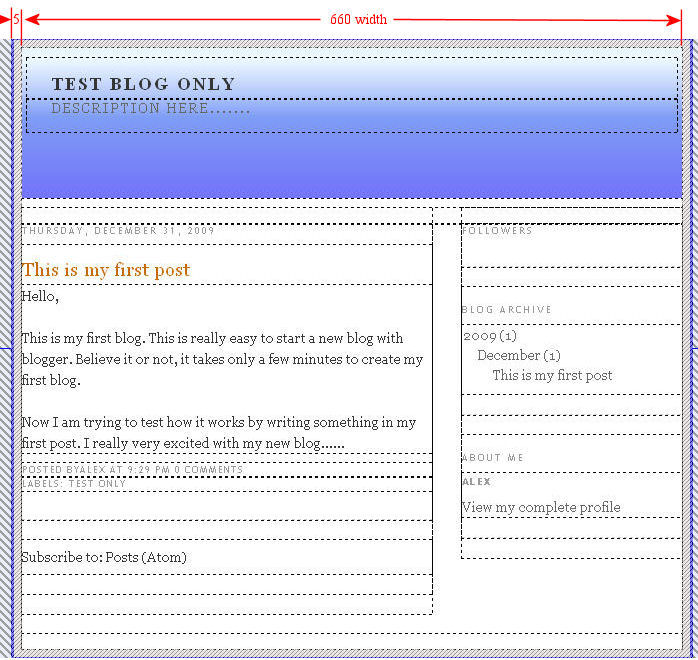
The width of Blogger Minima template is set in the #outer-wrapper selector.
#outer-wrapper {
width: 660px;
margin:0 auto;
padding:10px;
text-align:$startSide;
font: $bodyfont;
}
Pay attention to the width and padding styles:
width: 660 pixel width
padding: 10 pixels around four sides
Note:
If you wish to set the width of the template wider (e.g. 900 pixel), you need to change the width property of #outer-wrapper selector.
Header Section
You should be very familar with the Header Section as we have studied and customized the Header in previous tutorials.
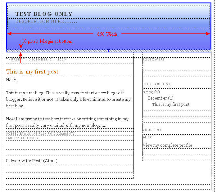
#header-wrapper {
width:660px;
margin:0 auto 10px;
border:1px solid $bordercolor;
}
Pay attention to the width and margin:
width of Header: 660 pixels
margin of Header: 10 pixels Margin at the bottom.
The 10 pixels margin provide some space between the Header and the Contents Sections (Blog Posts and Sidebar) below.
Note:
If you change the width of the template wider in #outer-wrapper (e.g. from 660 pixels to 900 pixels), you may also need to set the width of the Header(e.g. from 660 pixels to 900 pixels).
Width of Blog Posts
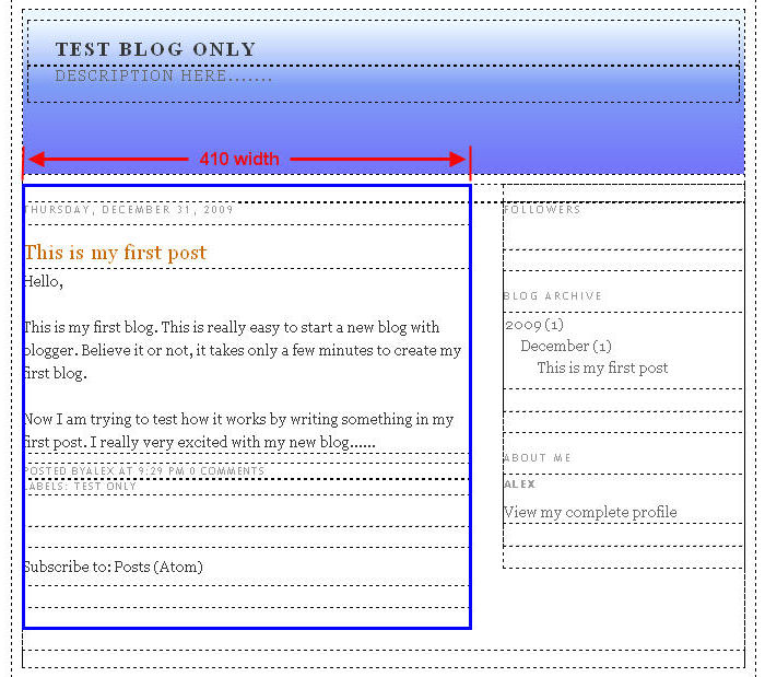
The Blog Posts section holds the posts. It is contained in the #main-wrapper div layer which is floating on the left.
#main-wrapper {
width: 410px;
float: $startSide;
word-wrap: break-word; /* fix for long text breaking sidebar float in IE */
overflow: hidden; /* fix for long non-text content breaking IE sidebar float */
}
Pay attention to the width of Blog Posts section:
Width of the Blog Posts section: 410 pixels
Note:
If you change the width of the template wider in #outer-wrapper (e.g. from 660 pixels to 900 pixels), you may also need to set the width of Blog posts wider accordingly (e.g. from 410 pixels to 600 pixels).
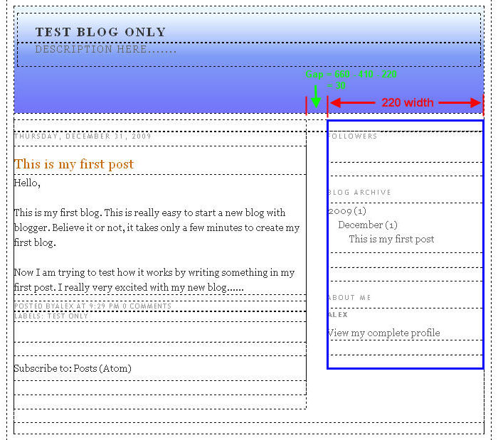
Width of Sidebar
#sidebar-wrapper {
width: 220px;
float: $endSide;
word-wrap: break-word; /* fix for long text breaking sidebar float in IE */
overflow: hidden; /* fix for long non-text content breaking IE sidebar float */
}
Pay attention to the width of the sidebar:
Width of Sidebar: 220 pixels.
Calculation:
The space or gap between the Blog Posts and Sidebar is 30 pixels (660 – 410 – 220).
Note:
If you change the width of the template wider in #outer-wrapper and the width of Blog posts, you may also need to set the width of Sidebar. Remember to leave some space between the Blog Posts and Sidebar.
Width of Footer
Pay attention to the width of the footerr:
Width of footerr: 660 pixels.
#footer {
width:660px;
clear:both;
margin:0 auto;
padding-top:15px;
line-height: 1.6em;
text-transform:uppercase;
letter-spacing:.1em;
text-align: center;
}
Note:
If you change the width of the template wider in #outer-wrapper and the width of Blog posts, you may also need to set the width of footer.
This Blogger section tutorial study further the Minima template layout – Header, Blog Posts, Sidebar and Footer.
Leave a Reply